How to make your brand’s content more accessible to all customers
August 29, 2022 - 12 minutes readA guide to making sure your content is clear, concise, and valuable.

Despite the fact that around one in seven people is neurodivergent, there is a significant lack of reasonable adjustments available in both the physical and digital world.
When it comes to web design, an alarming number of brands fail to provide inclusive or accessible experiences. As a result, droves of neurodivergent users are alienated from using certain digital services or unable to interact with brands online. In turn, businesses are missing out on a large segment of potentially loyal customers: when your online store or website isn’t accessible, no one wins.
But with the right tweaks and adjustments, you can make your store’s content more accessible to neurodivergent customers.
Let’s explore.
Making your store’s content more accessible: Essential tips
We live in a time where consumers have limitless access to information and buying opportunities with the swipe of a screen or the click of a button. But without gaining access to reasonable adjustments, countless people will only experience a slither of what the digital world has to offer them.
Neurodivergent people experience the world differently from neurotypical people (those whose brain functions or perceptions are considered “standard”). Particular colors, designs, graphics, processes, content, or visuals might not make sense to someone neurodivergent and may even cause distress or frustration.
Here, we look at tips that will help make your online store’s content clearer and more logical to neurodivergent customers—starting with formatting.
Format your text to make it scannable and easy to follow
How you format your online store’s text matters, as getting it right will make it easier for neurodivergent users to navigate every page with minimal frustration or confusion.
First of all, it’s important to understand that you should keep underlined, italicized, or CAPITALIZED text to a minimum to avoid creating confusion. Use these formatting elements sparingly by all means, but only to make a very specific point.
You can use bolded text formatting a little more, as it will help guide your store visitors to key aspects of your messaging. Breaking up your text into small chunks and using bulleted or numbered lists will also make your text more logical and easier to follow.
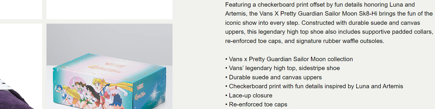
This example from Vans demonstrates how you can use plain, digestible text that is easy to navigate on-page. The product description is easy to follow, and the bullets highlight all of the key product USPs with a clear, concise approach while maintaining the brand’s warm tone of voice.
Make sure your messaging is plain and simple (leave the jargon at the door)
In addition to formatting your text well, getting your messaging is also critical if you want to make your online store’s content more accessible to neurodivergent users.
To make sure your copy is plain and simple, you should always read your sentences out loud to check if it flows well and sounds natural. It’s important to ensure your messaging is literal and gets directly to the point (idioms, adverbs, or unusual phrasing may not make much sense to someone neurodivergent).
If your copy is obscure and packed with industry jargon, people will bounce off your webpage and surf elsewhere for their shopping fix. Here are some copywriting tips that will help you avoid this:
Write your sentences or key points in as few words as you can. Cut away any unnecessary words or punctuation to make your messaging as punchy as possible
Adopt the active voice or tense rather than the passive voice or tense where possible
Check to ensure your messaging follows a logical format with a clear-cut beginning, middle, and end
Try online tools like Hemingway and Readable for real-time tips and hints on keeping your copy clean and clear
Read: 7 copywriting principles for the modern business age for extra tips on how to make your content accessible yet powerful across the board
Use plain colors that weave together well
Now, let’s get slightly more visual. As a lot of neurodivergent customers find it difficult to absorb or follow colors that are overly bright or contrasting, toning down your tones will make a big difference.
To avoid jarring your users with garish colors or clashing tones, you should choose a simple color scheme that you can roll out across every key page of your online store.
A little splash of color can work well, but use it sparingly. Typically, single hue tones or pastel coloring will make your store easier (and more calming) to navigate. Working with a plain white page background is also a good idea when it comes to making sure your use of colors isn’t confusing or overwhelming.
As a rule of thumb, using a maximum of three colors on any one webpage will work well and improve the overall neurodivergent user experience (UX). The best way to use your colors and make your web design as logical as possible is by assigning them to different page elements—for example:
Color 1 for headings and subheadings
Color 2 for call to action (CTA) buttons
Color 3 for anchor text or hyperlinks

This example from the tech brand Zendesk is worth noting as it showcases how the subtle, consistent use of pastel tones makes a webpage far easier to follow without overwhelming users. Here, the heading is constructed with additional colors that are subtle and blend well with the rest of the page’s design.
Add practical visuals to complement your store’s messaging
Much like your store’s color scheme, when adding graphics or imagery to a webpage, it’s vital that you keep your visuals clear, free from clutter, and avoid any obscure imagery (be as literal as possible).
To do so, when choosing or designing your visual elements, you should avoid anything too bright and make sure that your graphics or photographs have no more than two main points of focus.
Your imagery should complement your copy and serve to bring your messaging to life. To make your visuals extra accessible, offering a written description of what’s happening in each picture and adding alt text is also a good idea.

This example from Nike is effective, as the imagery and messaging work in harmony to deliver a clear and concise message to the user. The color scheme is subtle, and the imagery offers a clear point of focus, showing two happy Nike Membership holders. Clean, clear, and consistent.
Don’t confuse with your call to action (CTA) copy or buttons
If you’ve led a good portion of your users to one of your CTA buttons, you must be doing something right. But remember, if you get your CTA messaging wrong, you won’t enjoy a healthy flow of sales or conversions.
Your CTA buttons or messaging are vital because it tells your users what to do next or lets them know why they should click through. Connecting clear and punchy CTA messaging is especially important for neurodivergent customers.
To win with your CTAs, avoiding any designs that are awkward or clunky is essential. It’s also worth noting (or reiterating) that your CTA button’s color choice should be subtle and consistent with the rest of the page (no floating neon “buy now” signs).
The more literal your CTA messaging, the better. Here are a couple of examples to help you on your quest for success:
What not to do:
<Click This for More>
This text is long-winded, clunky, and provides no clarity on why the user should click or what to expect next, which is vital for many neurodivergent customers.
What to do:
<Shop for Belts>
Here, the text is snappy, rolls off the tongue, and tells the users exactly what to do next or what they can expect from the next stage of their journey. In this case, it’s a choice of belts to browse and potentially buy.
Offer neurodivergent customers accessible content formats
Last but certainly not least, when making your store’s content more accessible to neurodivergent customers, you should aim to offer additional formats, including:
On-page audio reader tools that narrate your copy to users as they navigate your store
Customization bars or functionality that allows customers to tweak page elements like brightness, tones, or text size
Descriptive subtitles to make your video content easier to follow and understand
Tip: When you’re producing content for your online store, following the ADA compliance and WCAG guidelines will ensure the end result is as accessible as possible.
Final Thoughts
Inclusion should exist everywhere. As a modern retail or eCommerce business owner, making your store’s content more accessible will showcase your commitment to inclusion while opening up your products or services to more customers. It’s a situation where everyone wins.
We hope this guide helps you make your store’s content more inclusive and for more business-boosting advice, check out our 10 top tips on creating a strong visual identity for your brand.