Your Guide to Driving Down Cart Abandonment & Optimizing Your Webstore
September 30, 2021 - 12 minutes readEverything you need to know about creating a seamless shopping experience.
As a retail or eCommerce business owner, you’ve likely encountered your fair share of cart abandonment. You may have even noticed spikes in customers bouncing off certain pages within your online store before even reaching the checkout page.
While cart abandonment is frustrating and sometimes costly, it’s more common than you might think. The average shopping cart or shopping journey abandonment rate across industries is 69.57%. And for mobile shopping, it’s 85.65%.
Most brands and businesses suffer from poorly optimized shopping journeys. The good news is, there are ways to improve your store’s shopping and payment experience to reduce cart abandonment rates, improve customer loyalty, and earn more sales.
Here, we’re going to explore the key aspects of the online shopping journey and offer practical advice on how you can optimize your store for ongoing success.
But first, let’s consider the main issues that lead to cart or shopping abandonments.
Shopping journey and cart abandonment: The big issues
To optimize your shopping journey and provide a seamless shopping experience, it’s important to understand why customers are abandoning your carts or giving up on their purchases.
By working with your store’s data, you can analyze the behaviors of your site visitors while monitoring the performance of certain web or landing pages. Doing so will help you gain a clear understanding of what’s working and what isn’t, which, in turn, will give your optimizing efforts direction.
To start, here is a rundown of the most common reasons for shopping or cart abandonment across industries:
- Incorrect links or broken internal page links
- Poorly designed product, landing, or checkout pages
- An absence of product information and confusing instructional copy or text
- Too many stages in the shopping or buying journey
- Not enough payment options and too much effort to pay
- Not enough information on shipping or returns
- Features including dropdown boxes and autofill options missing from checkout
Now that you know the common reasons for poor shopping experiences or cart abandonment, you can get to the root of the issue and make some all-important changes.
Testing & user experience (UX) design
Once you’ve consulted your data, worked through the list of common shopping journey or cart abandonment issues, and pinpointed some of the key issues causing your customers to give up on their purchases, you can conduct a little optimization testing.
Targeted A/B testing
Armed with your shortlist of shopping experience or cart abandonment issues, you’ll be able to carry out A/B testing on relevant parts of your shopping journey.
A/B testing, also referred to as split testing, is the process of taking two versions of the same product, landing, or checkout page to find out which one performs best while uncovering the content or page elements (call to action buttons, blocks of texts, page headings, links, graphics, etc.) that result in the most engagement or conversions.
By working with a modern A/B testing platform, you can collect priceless engagement data, discover which variations of text, imagery, video, graphics, or functionality prove most effective, and gather the intelligence you need to design a page that improves the user experience (UX) and increases conversions.
Through regular testing and analysis, you will gain the power to optimize every stage of the online shopping process for steady growth and success.
Bonus tip: In addition to carrying out targeted A/B testing, you should also have your internal team or a focus group to test variations of your shopping journey and offer their feedback on how you can improve the process.
User experience (UX) enhancements
Through A/B testing and user feedback, you’ll know exactly where to aim your shopping journey optimization efforts.
A seamless web page design can boost conversions by up to 200%—a testament to the power of focusing on user experience (UX) enhancements.
UX enhancements are the design or messaging improvements you make based on your testing activities. It’s any tweak or update that makes it easier for your customers to consume information, navigate their shopping journey, and ultimately make a purchase.
Any friction or confusion in the process will usually result in abandonment. Based on your discoveries, you can make UX enhancements in these key areas:
- Improve your pages’ UX and microcopy to help your users connect with relevant information faster and guide them through every stage of the shopping journey with clarity and transparency.
- Show how your products or services work with dynamic graphics or a video.
- Play with unusual designs and layouts while ensuring everything flows logically. When tweaking your design based on your testing insights, make sure your imagery and messaging fit into a narrative that will keep the user engaged at every stage of the shopping journey.
 Screenshot
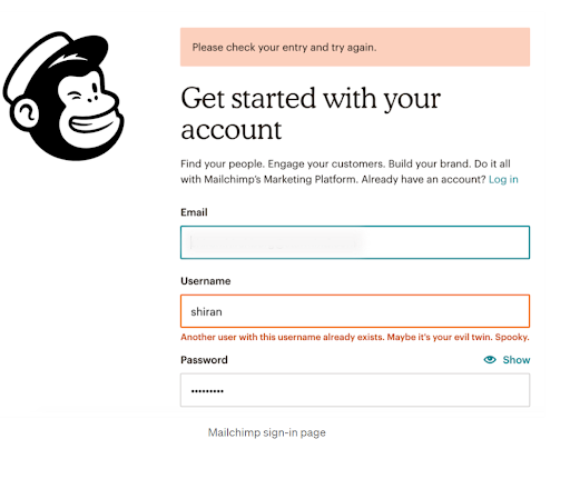
This example from MailChimp is worth taking note of, as it shows that when it comes to the shopping journey or user engagement-based design, you should cover every base. Here, MailChimp has opted for a minimal yet clean design with quirky error text that engages the user while telling them what’s happening in plain terms.
- Place your CTA at the top as well as the bottom of your store’s pages.
- Make sure your links and CTA buttons are clear, prompt a desired action (particularly on your shopping cart page), and are easy to find on-page.
Remember: Once you’ve made the right improvements based on your data analysis and testing, make sure you monitor and measure the performance of your new UX enhancements. When it comes to shopping journey optimization, the testing never stops. The world of retail & eCommerce is ever-changing, and by committing to continual testing, you will remain robust, relevant, and adaptable at all times.
Enhance your underperforming product & landing pages
Your service or product landing pages (if you’re a retail or eCommerce business, we’re guessing you have lots of them) are usually where shoppers make that all-important decision to press the “buy” button or go elsewhere.
If you’ve identified the product or landing pages that are underperforming, you can implement optimizations that make them more persuasive, informational, navigable, and inspiring.
To help you on your quest to improve your underperforming product or landing pages and lay solid foundations for your shopping journey, here are three resources you should read:
- How to produce product pages that get results
- 15 actionable ways to optimize your store’s product pages for more sales
- 5 ways to use cognitive bias to your eCommerce or retail store’s advantage
Improve your choice of payment options
Once your customers are at the checkout page (towards the end phase of the shopping journey), there’s no room for second-guessing or confusion.
In addition to page design, microcopy, and CTA buttons, payment options have a major influence on cart success or abandonment rates.
Offering your customers multiple payment options is likely to increase your conversion rates while inspiring customer loyalty.
By taking the time to get to know your main customer demographics (different generations prefer different payment options) and gathering data from market research (directly asking your audience which payment options they prefer), you will be able to make informed decisions that result in more conversions.
For your guidance, here is a list of the payment options that today’s tech-savvy consumers value most:
- Google Pay
- Apple Wallet
- Klarna—a buy now pay later (BNPL) option
- Clearpay (another modern installment-based BNPL payment method)
- PayPal
- Credit & debit card (traditional & contactless)
- Mobile-centric incentive schemes (store-based credit & discount codes)
- Payoneer
- Bitcoin
Once you’re up and running with your payment options, you should track and monitor your sales sources closely and consider which payment methods are performing the best. Replace or get rid of any payment options that appear redundant, taking up unwanted space on your checkout page.
 Screenshot
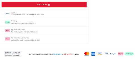
This checkout page example from popular sports eCommerce retailer MandM Direct is equipped with multiple payment options, with the icons clearly displayed on-page along with microcopy explaining the terms for each method. The page design is clear, the place order button stands out, and the strategically placed Feefo graphic inspires consumer trust, which helps boost conversion rates.
By pinpointing the issues that are hindering your brand’s shopping experience and taking strategic measures to optimize the key areas of your journey, you will see your sales rise year after year.
We hope this guide helps you get to where you need to be. If you need to improve your store for greater eCommerce or retail success while gaining insights that will help you understand your customers better, we have the solution.
To find out more, get in touch, and we’ll be happy to answer any questions. We look forward to hearing from you.